
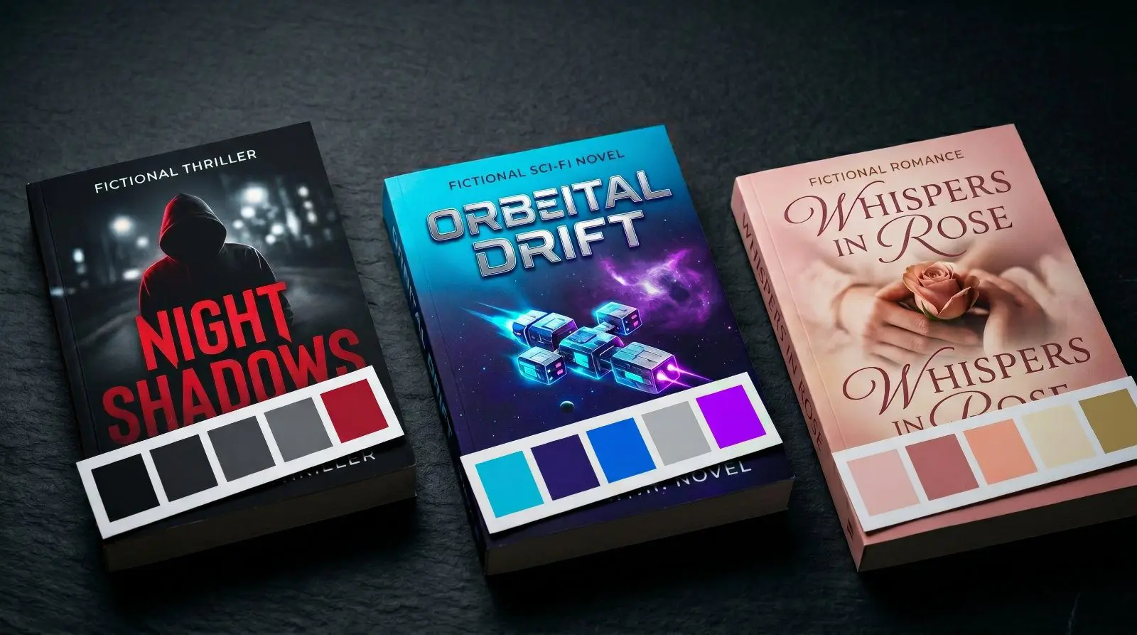
Your book cover color palette should drive every visual decision on your author website — and picking the wrong colors sends readers running before they ever read a word. Here are 10 genre-specific palettes with hex codes you can copy-paste today.
🎨 Why Your Genre Should Drive Your Color Choices
Here’s something most indie authors don’t think about: your book cover color palette should be driving your entire website design — and for most authors, it isn’t.
A reader who writes cozy mysteries lands on an author website with blood-red backgrounds and jagged typography? Gone. A romance author using cold steel grays and clinical whites? That’s sending the completely wrong signal. There’s a reason the psychology of color in marketing is a real field — colors trigger emotions before a single word gets read.
Your color palette is a promise. It tells visitors — in about two seconds — what kind of experience they’re about to get. And if that promise doesn’t match your genre, readers bounce.
Think about your book cover. You’d never put a pastel watercolor cover on a military thriller. The same logic applies to your website — your book cover color palette and your website palette should be telling the same story.
The good news? You don’t need to be a designer to get this right. You just need to know what works for YOUR genre. That’s what this cheat sheet is for.
📚 10 Book Cover Color Ideas by Genre
Here’s our go-to book cover color palette for each major genre. Every palette includes 4–5 colors you can drop straight into your website — background, accent, text, and highlight.
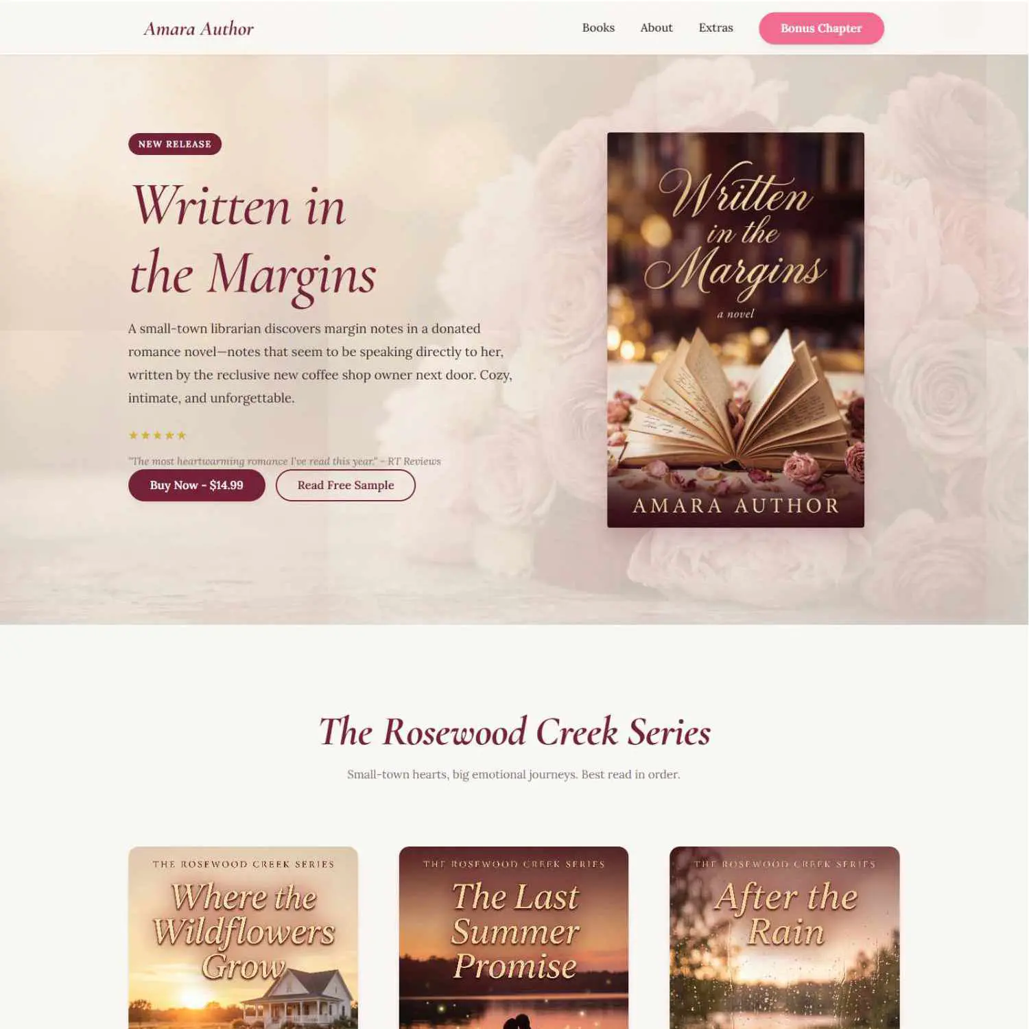
💕 Romance — “The Blush & Bloom”
Romance readers expect warmth, emotion, and just a touch of tension.
The vibe: Think warm coffee shop, candlelight, a little bit of edge. The violet accent is what gives it a modern feel — without it, you risk looking like a Valentine’s Day card.
See this palette in action → Browse Romance Templates
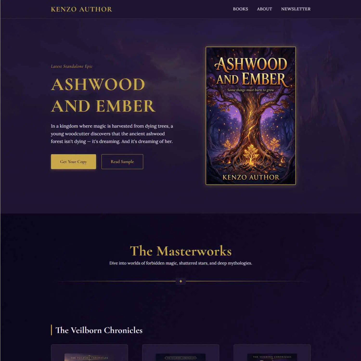
⚔️ Romantasy — “The Ornate Maximalist”
Romantasy is the genre of “tactile luxury.” These sites should feel like artifacts from the world of the book.
The vibe: Dark, rich, and dripping with detail. If your book has thorns, crowns, or morally gray love interests, this is your palette.
See this palette in action → Browse Romantasy Templates
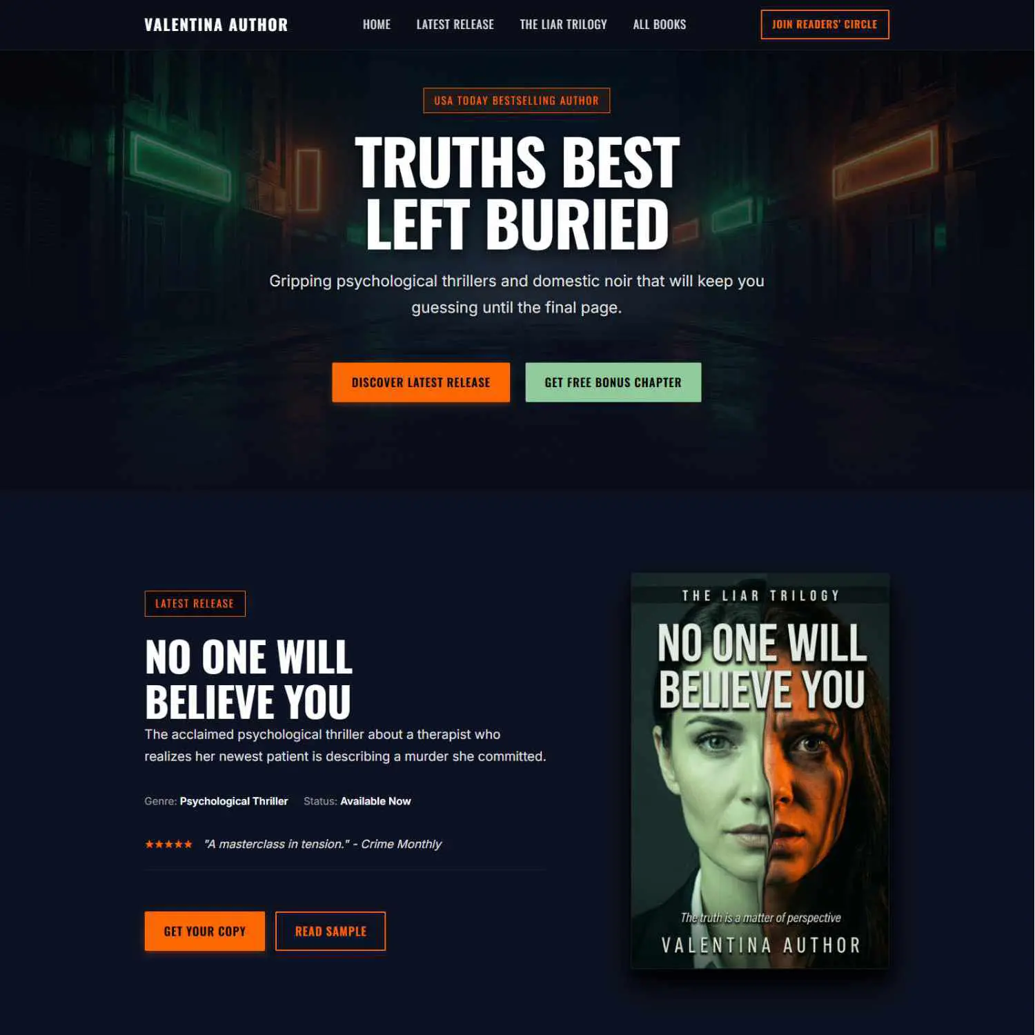
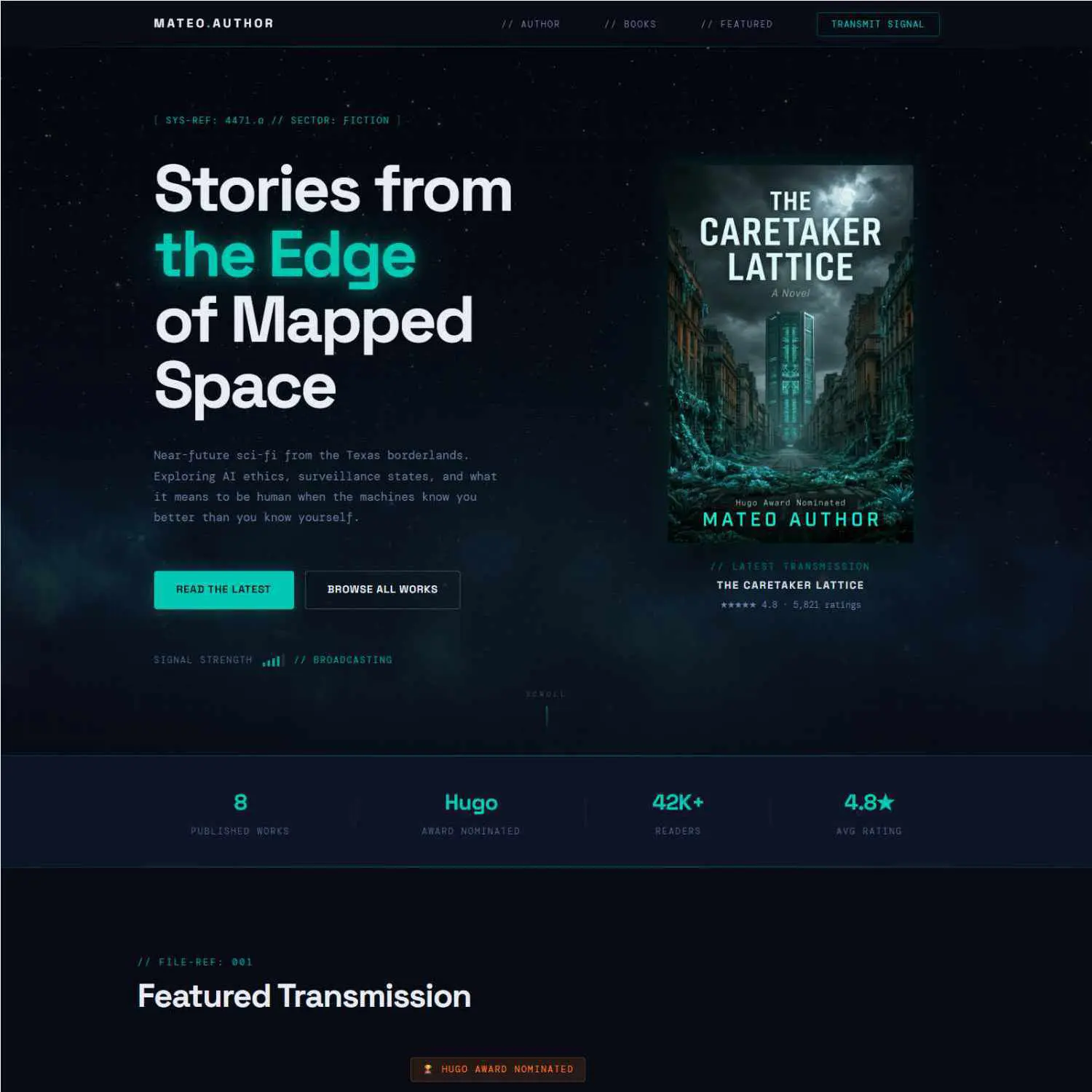
🔍 Mystery & Thriller — “The Neon Shock”
Thrillers need tension. Your palette should create a sense of unease — something slightly off-kilter.
The vibe: Like walking into a dimly lit bar where something’s about to go very wrong. The neon accents against the dark base create that psychological edge.
See this palette in action → Browse Thriller Templates
🚀 Science Fiction — “The Neo-Mint Futurism”
Sci-fi in 2026 leans “hopepunk” — optimistic technology, not dystopian gray.
The vibe: High-tech but grounded. The mint-to-blue gradient feels like a star map. The persimmon pop keeps it human.
See this palette in action → Browse Sci-Fi Templates
📖 Literary Fiction — “The Minimalist White”
Literary fiction screams confidence through restraint. Less is more — way more.
The vibe: Gallery opening. Quiet authority. The negative space does the talking. If your readers love Donna Tartt or Sally Rooney, this is home.
See this palette in action → Browse Literary Templates
⚡ Young Adult — “The Electric Sunset”
YA readers respond to energy, emotion, and visual boldness. Your site should feel like a vibe check.
The vibe: Bold, unapologetic, a little rebellious. The kind of site that makes a teenager screenshot it and send it to a friend.
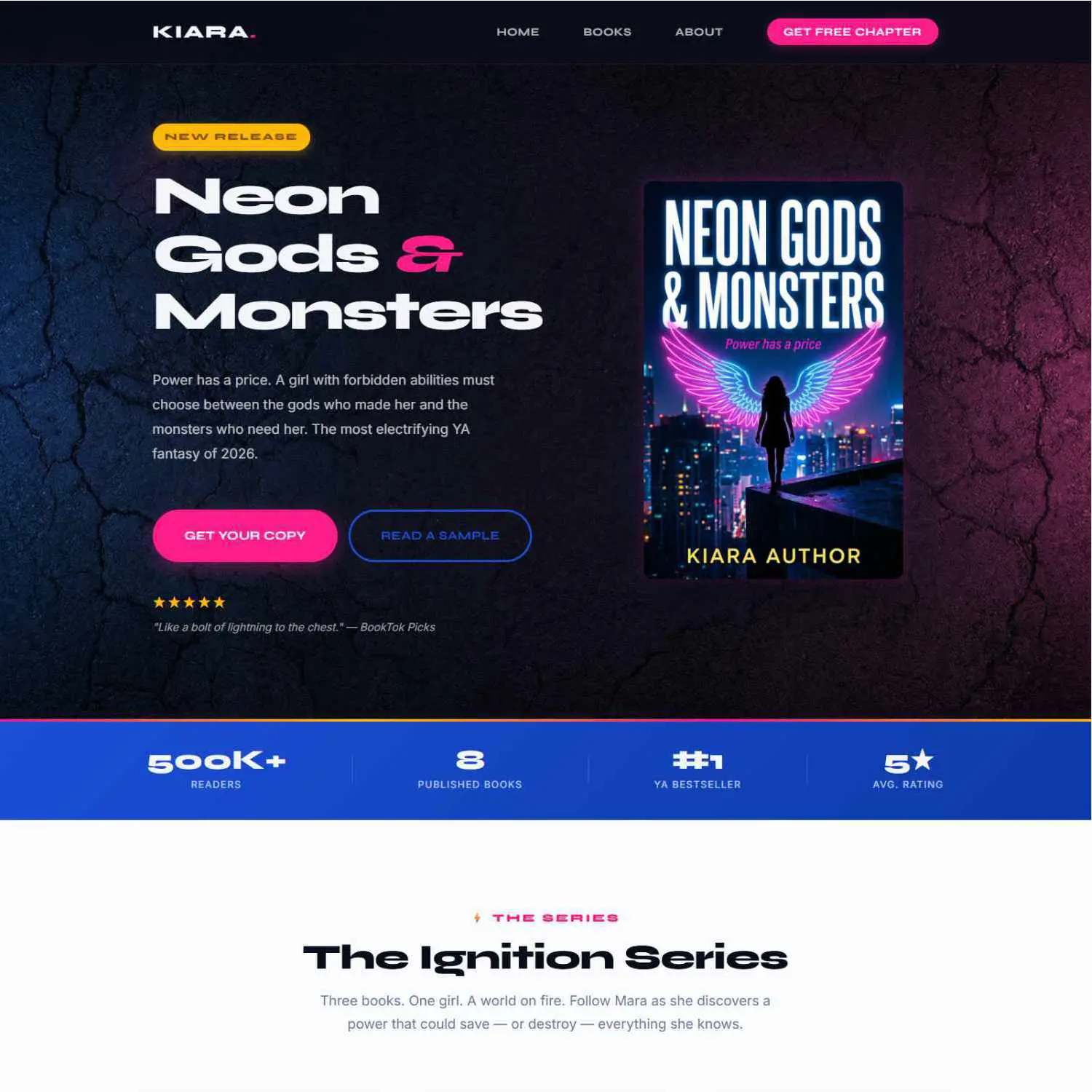
See this palette in action → Browse YA Templates
🧸 Children’s Literature — “The Tactile Storybook”
Children’s books in 2026 are going anti-digital — warm, hand-painted, and inviting.
The vibe: Like picking up a book in a sunlit library. Safe, warm, and inviting. Parents trust this aesthetic instantly.
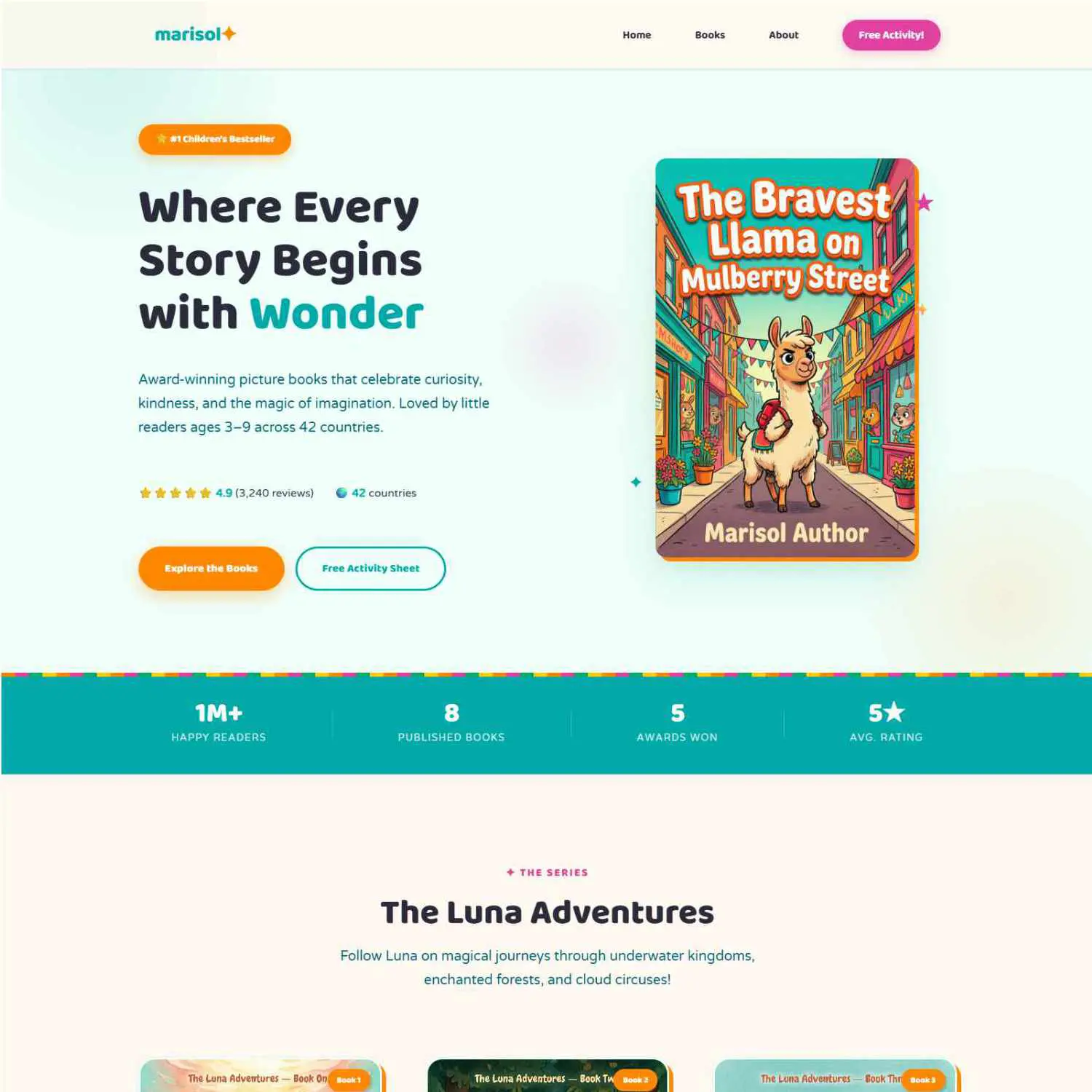
See this palette in action → Browse Children’s Templates
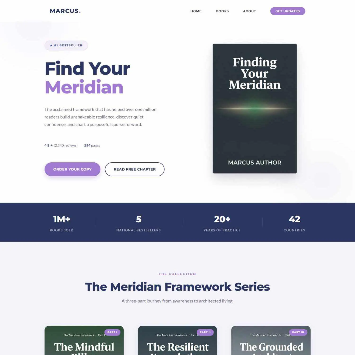
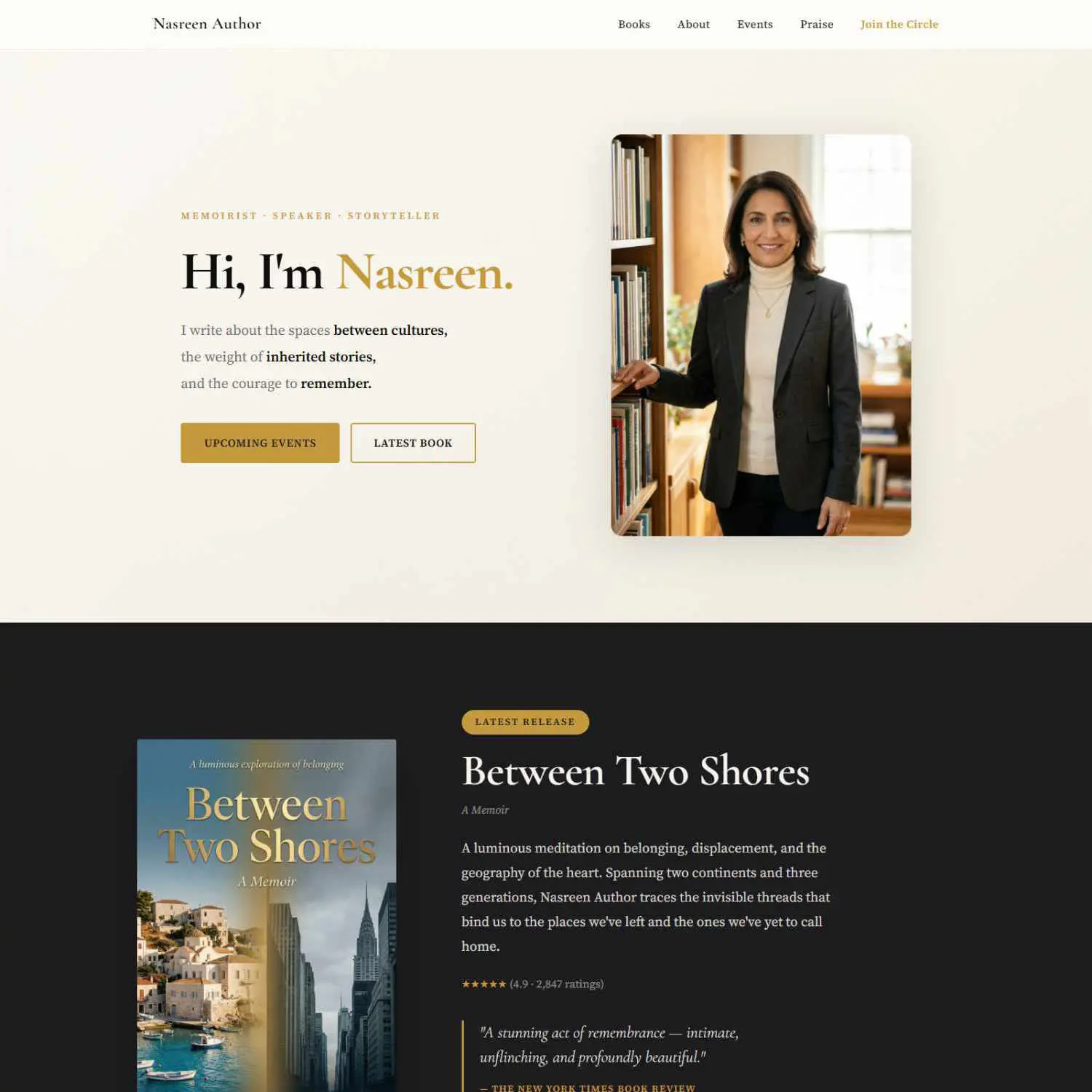
📝 Memoir & Biography — “The Prestige Archival”
Memoirs demand sophistication. This is “The Gallery Aesthetic” — clean, quiet, and intentionally understated.
The vibe: Leather-bound journal meets modern gallery. The oxblood and gold say “this story matters.” It commands respect.
See this palette in action → Browse Memoir Templates
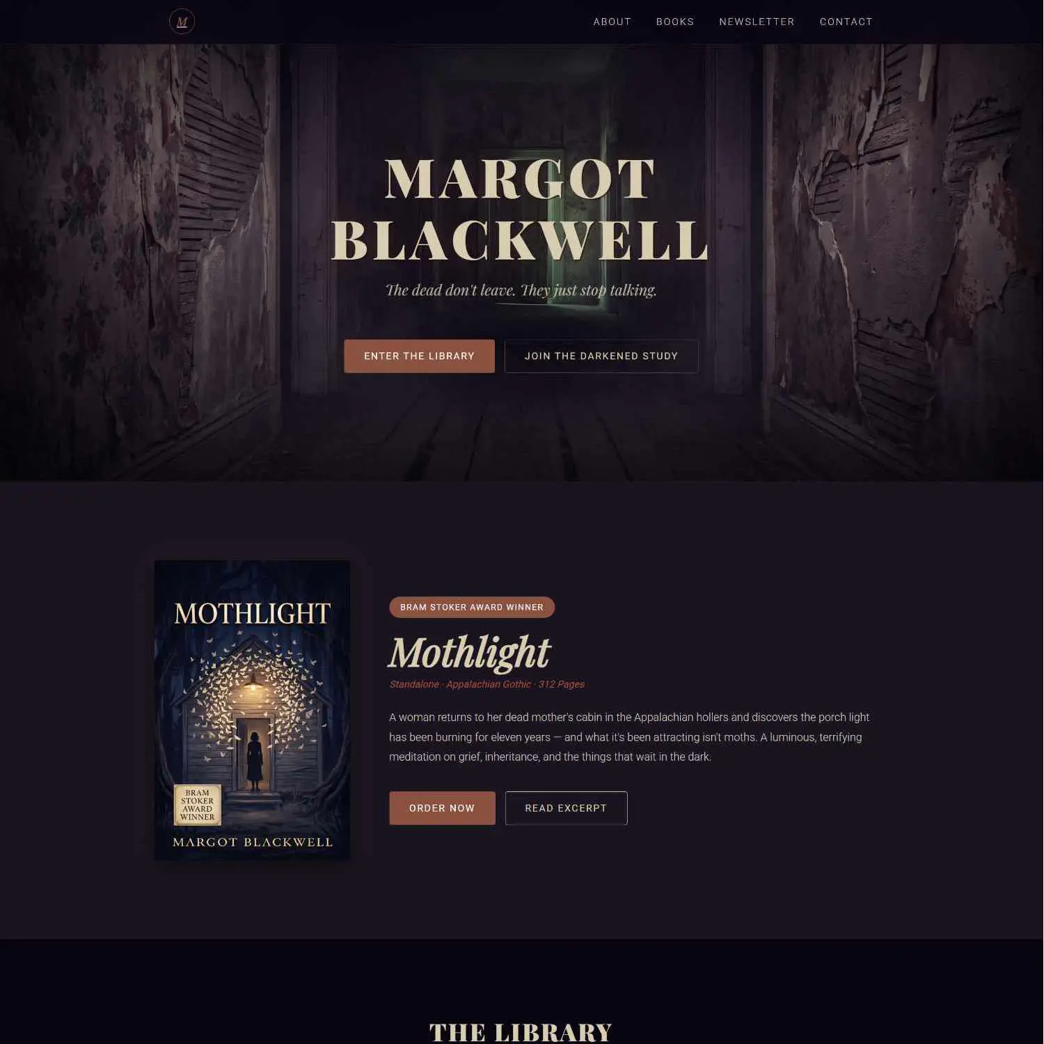
👻 Horror — “The Surrealist Shadow”
Horror sites should feel wrong in the best possible way. Something’s off — and the reader can’t look away.
The vibe: Bioluminescent darkness. Like a deep-sea creature glowing in the abyss. The acid lime against void purple creates instant unease. Perfect.
See this palette in action → Browse Horror Templates
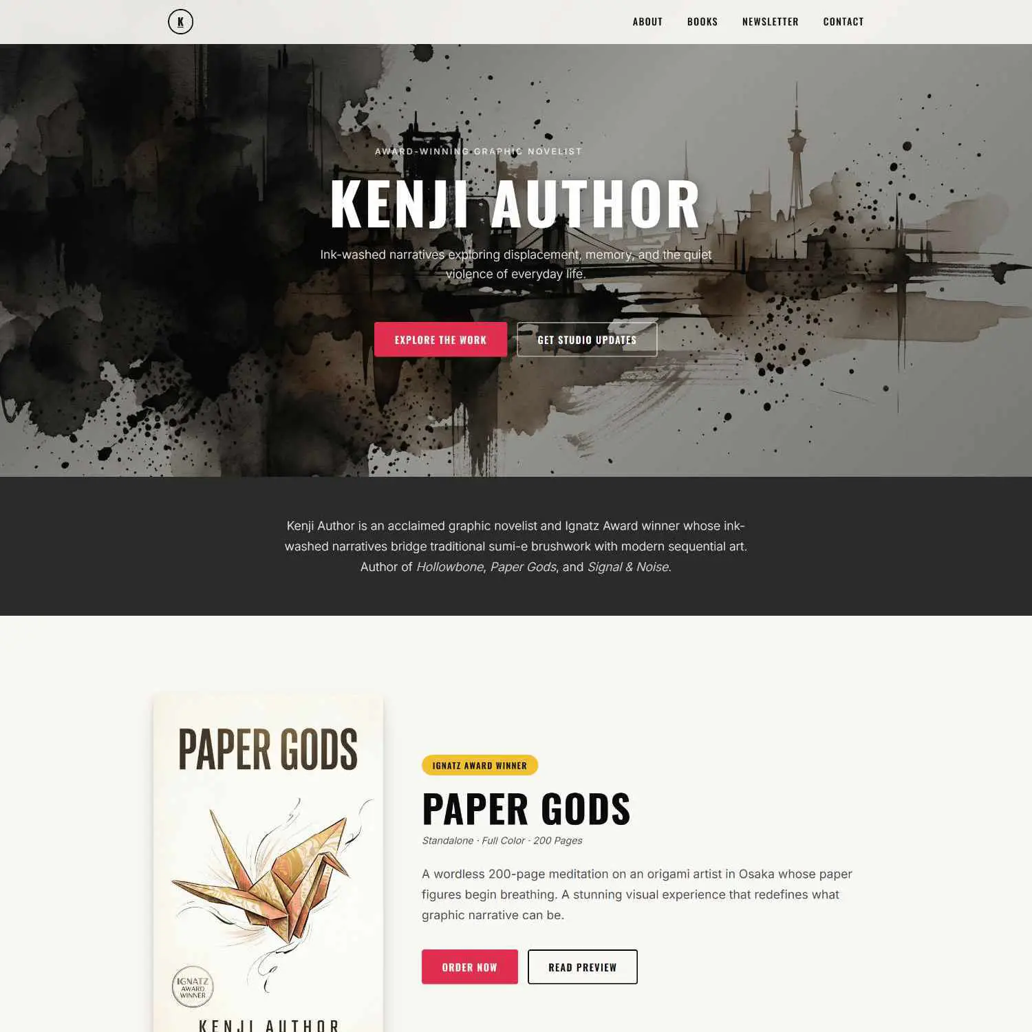
🎬 Graphic Novels & Manga — “The Cinematic Pop”
Limited palette, maximum impact. These sites should feel like a movie poster.
The vibe: Cinematic. High-contrast. Every element is deliberate. Three colors, zero wasted space.
See this palette in action → Browse Graphic Novel Templates
🛠️ How to Apply These to Your Author Website
Having the right palette is step one. Here’s how to actually use it:
| Element | Which Color to Use |
|---|---|
| Page background | Background color (the lightest or darkest in your palette) |
| Headers & navigation | Primary color |
| Buttons & CTAs | Accent color (this should POP) |
| Links & hover states | Highlight color |
| Body text | Text color |
Three rules to live by:
- 60-30-10 rule. 60% background, 30% primary, 10% accent. This keeps your site from looking like a paint factory exploded.
- Test on mobile. Colors look different on phone screens. What looks subtle on a desktop monitor can look washed out or blown out on a phone.
- Match your book covers. Your book cover color palette and your website palette need to tell the same story. If your latest cover uses deep navy and gold, your website should echo that — not clash with it. Your homepage is an extension of your brand, not a separate thing. And when you’re sending out email campaigns, that same visual consistency should carry through.
📋 Here’s What We Covered
- ✅ Your color palette is doing marketing before anyone reads a word
- ✅ Every genre has a visual DNA — match it, and readers trust you instantly
- ✅ We gave you 10 genre-specific palettes with exact hex codes
- ✅ Use the 60-30-10 rule to apply your palette without overwhelm
- ✅ Always match your book covers to your website colors
The biggest takeaway? Your website’s colors aren’t decoration — they’re communication. Get them right, and readers feel at home before they’ve read a single word. Ready to put your palette to work? Our guide on building your author website walks you through the full process.
❓ FAQ
Can I use colors from different genre palettes?
You can, but be intentional. If you write romantic suspense, blending Romance and Thriller palettes makes sense. But don’t mix Children’s with Horror unless you’re going for something very specific (and very confusing).
What if I don’t know my genre’s “look”?
Start with your book covers. Pull 3–4 colors from your latest cover using a free tool like Coolors.co — just upload your cover image and it’ll extract a palette instantly. Your covers already know what your genre looks like.
Do I need to hire a designer to get these colors right?
Not at all. These hex codes are copy-paste ready. Drop them into your website builder’s color settings and you’re done. If you want a site that’s already built around your genre’s visual DNA, you can browse our template library — every template is designed with genre-specific palettes baked in. 🎨